Digital SLR owners (and perhaps some digital point and shoot's as well) have the ability to view photos they've taken along with something called a "Histogram". This article will explain what a histogram was and how it can be used to improve your photography.
What is a histogram?
Well, it's a graph, so let's start with an example: (Click on the photo to view a larger version.)
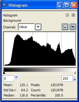
Below the graph, you can see the key, which goes from black all the way on the left, through all the shades of grey until it gets to white at the right-hand side.
So, the graph represents the data in the photo broken down to show how much of the data is of dark, light, or one of the shades of grey in-between.
Does that mean it only works for black and white photos?
No, the histogram works for color photos as well. It's more about "tone" dark red and dark blue are both treated the same (as "dark")... You can think of it as the camera converting the color to black and white to create the histogram if it makes it easier for you to conceptualize.
So, what does this information tell you?
Well, when you review a photo on the LCD screen of your camera it's hard to tell if your photo is too light or too dark because the brightness of your LCD is adjustable. So, how do you know if your photo is dark or if the LCD brightness just needs to be increased because you're outside in sunlight and your LCD was adjusted indoors? The lesson: Looking at the histogram is much more accurate than looking at the photo on your LCD.
What we are often most concerned about when it comes to exposure (how light or dark the photo is) is to make sure that we didn't over-expose or under-expose the photo to the point where we lost detail in the highlights or shadows. We can tell if we've lost detail in the shadows because the data on the histogram will go off of the far left of the graph (the black part), or if detail was lost in the highlights, the photo the data will go off the right side of the graph.
Practical use:
So, let's look at that sample histogram at the top of this article -what does it say about the photo it was taken from?See how the graph ramps up slowing from the left? that means that there's very little absolute 100% black pixels, so there's no detail loss in the shadows. Now, look at the right side -it doesn't peter off as slowly on the right as it did on the left does it? Instead, it abruptly gets cut off. That means there's a lot of 100% white pixels, which means there was some detail loss in the highlights.
It's easy to assume that histograms that fall off of either side are "bad", but that's not the case. It's important to consider the photo you've taken when looking at the histogram because sometimes under or over-exposed areas are ok. (If you're using a white background and you want it to be blown out for a "high key" look, for example.)
Examples / Practice:
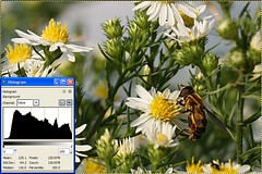
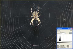
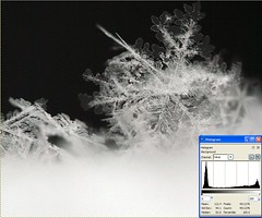
Here are some example photos along with their histograms so you can get a better feel for how to read a histogram: (click the photos to view the large version).
A photo showing a wide range of tones (slightly overblown):
A photo with the majority of it's data in the dark area of the histogram:

A photo showing a lot of over-exposure in it's histogram:

A photo showing a lot of dark and light areas without much in-between (grey):
Links:
For further reading, see: http://www.luminous-landscape.com/tutorials/understanding-series/understanding-histograms.shtml
..and here's a reason you may want to intentionally over-expose your photos by a little bit. (VERY interesting): http://www.luminous-landscape.com/tutorials/expose-right.shtml
1 comment:
Very clear for us nubs to life beyond the point and shoot cameras. I followed this link from the Gimp flickr group- what a great help it is.
Post a Comment